2023, Stylesaves
made online shopping less overwhelming
Role
UX Designer (Solo)
Duration
10 weeks
Skills
User interviews
competitive analysis
product strategy
information architecture
usability testing
visual design
introduction
Project Spark
I sat in the living room with a friend and watched her click through seven different tabs of retail stores, scroll through the 2-15 items she had in each cart, sigh, and then close her laptop.
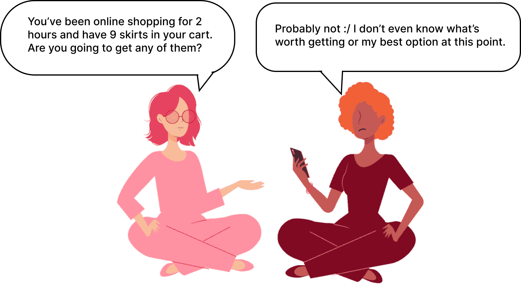
This got me wondering: Was my friend's struggle of excessively online browsing only to find nothing purchase-worthy a more widespread problem than just her?
The Opportunity
The online retail problem space affects an increasing number of people as our world becomes more digital. If I could validate this problem of an overwhelming online shopping experience to be more widespread than just my friend, there would be a huge market for a solution.
the process
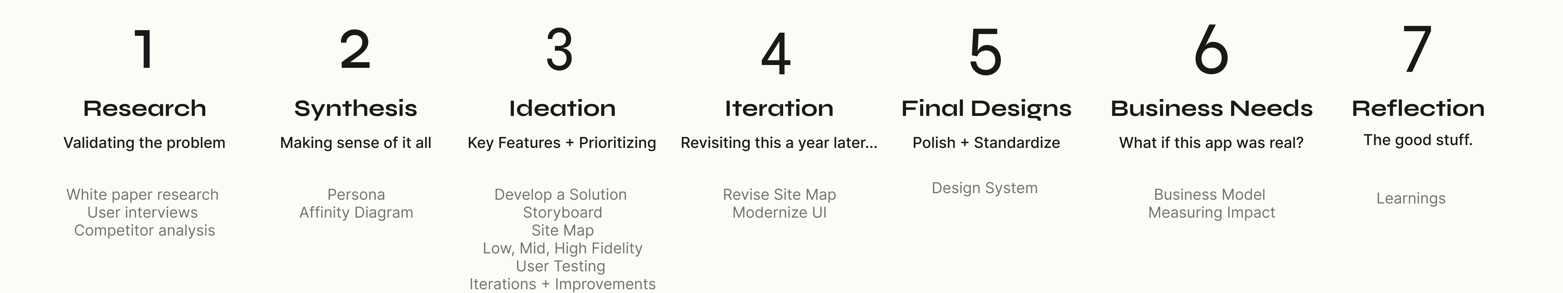
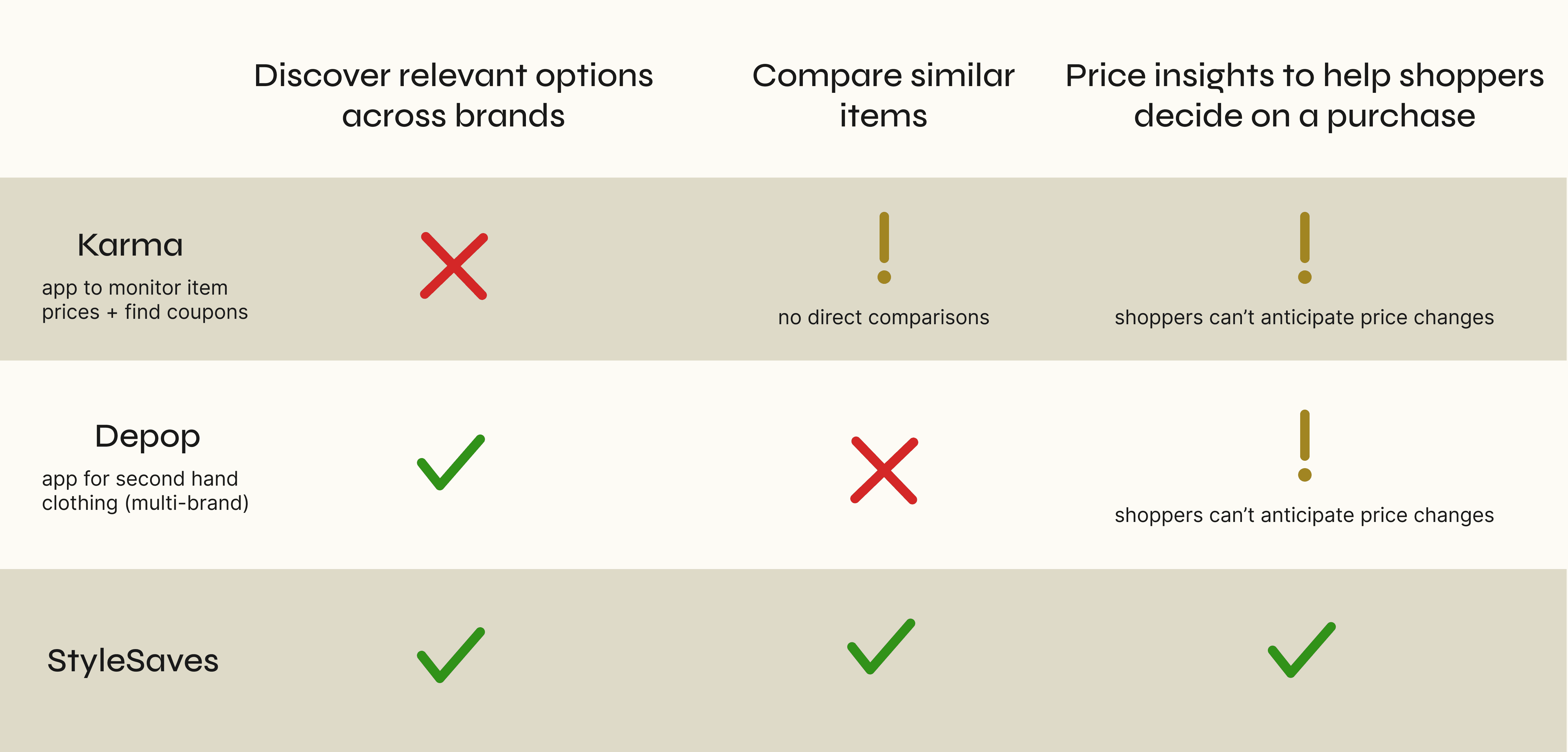
Competitor Analysis
After identifying the three biggest pain points shoppers were having, I needed to see how well current solutions addressed these pain points. Was there a need for my solution?
I found no direct competitors, and indirect competitors, who solved different problems or served a different target market, did not address all three pain points.
The Designing
Storyboarding a High-Level User Journey
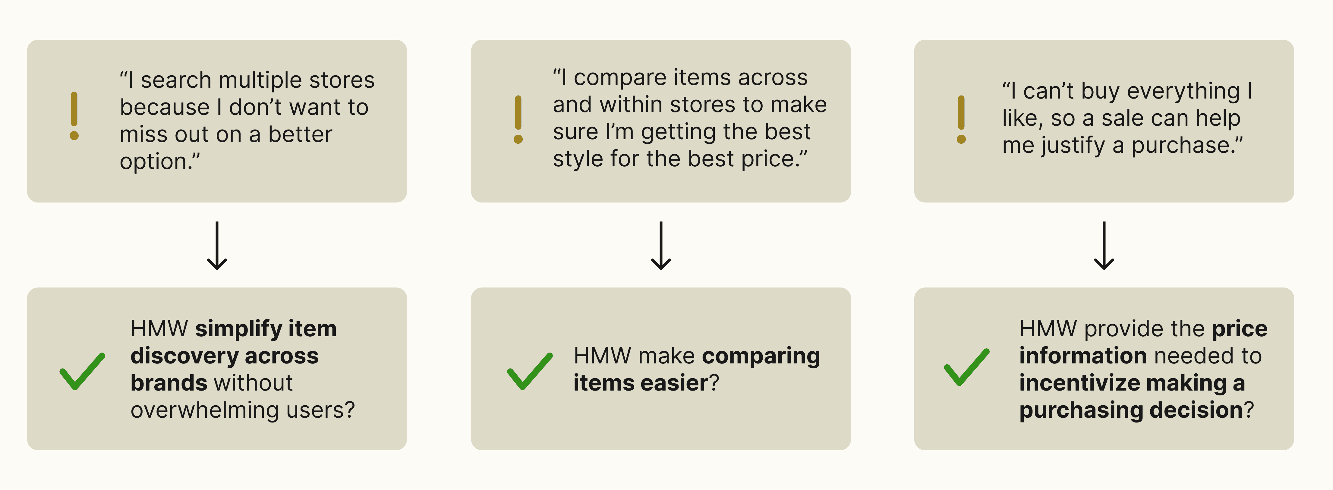
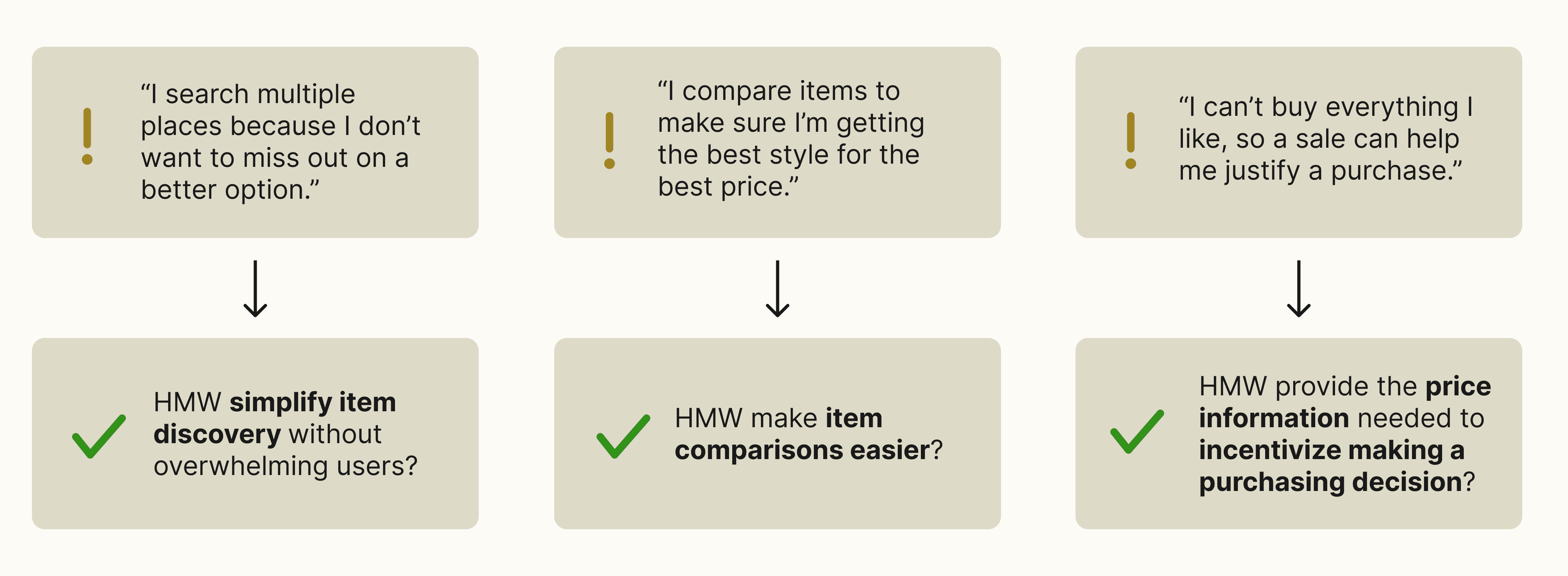
With the key user needs established and no solution on the market addressing these needs, I was ready to design. But before I made any screens, I wanted a high-level idea of how I could address these 3 needs in one app in a cohesive way. So I brainstormed features, prioritized them, and then created a storyboard with the features that were most important.
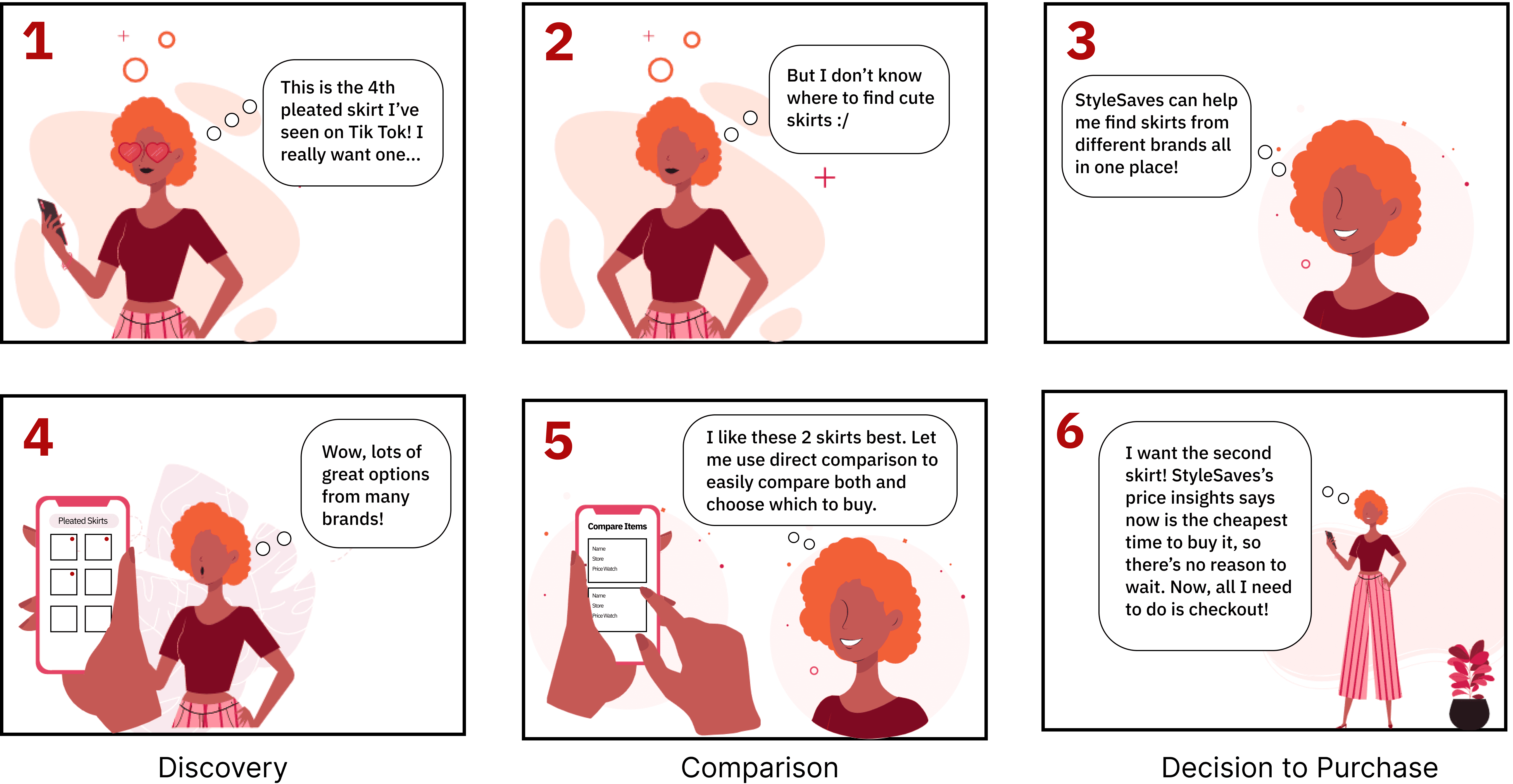
Our storyboard shopper can 1) easily discover relevant options from multiple brands in one platform, 2) directly compare items across stores, and 3) see all the price insights they need to make a purchasing decision.
Site Map Information Architecture
After establishing key features and a high level user flow, it was time to think about how it all pieced together. How could I create an information architecture that helped users easily locate what they needed, when they needed it?
I revisited this project a year after its initial completion to apply the ways I had grown as a designer. Specifically, one goal I had was to challenge my initial information architecture decisions. During this revisit, I thought how I could increase visibility and easy access to the most important features?
Old information architecture

New information architecture

Iterations
Designing, Iterating, and Testing
With clarity on what I was designing and how it would all fit together, it was Figma time.
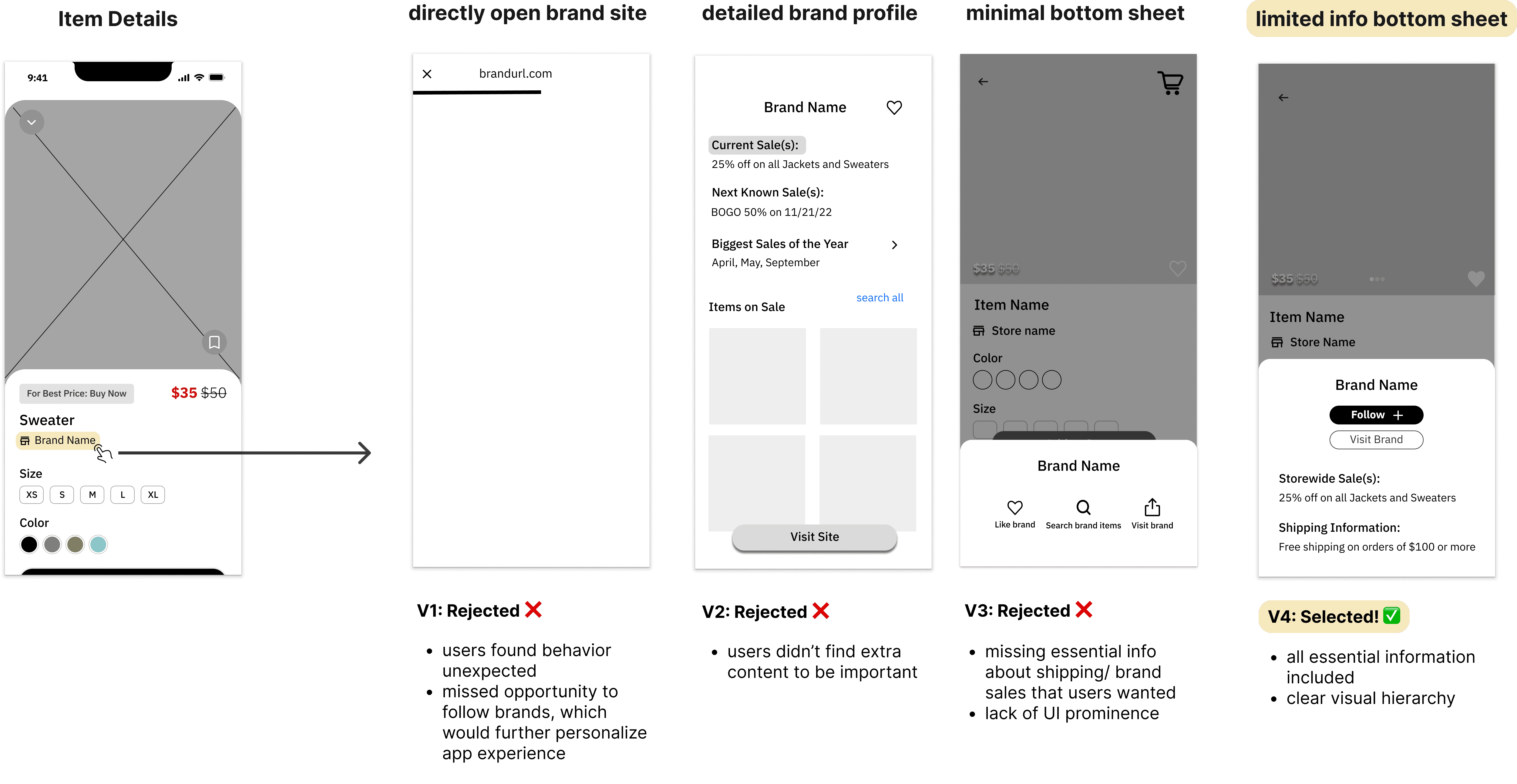
Early on, I concept-tested low-fidelity UI interactions for a brand profile. Concept testing was important because as a solo designer, I didn't have other designers to do design critiques with, so I wanted to validate my thinking early on.
I chose to concept test the brand profile because it could provide important information users considered before purchasing from a brand like their shipping policies and sales, and was an opportunity to better understand user’s preferences so better recommendations can be made.
Concept Testing
Clicking on Brand Name
Later in my design process, I user-tested the direct item comparison feature in high fidelity because it addressed one of users' greatest pain points, so it was crucial to get feedback on and design well.
User Testing
Direct Comparison Feature
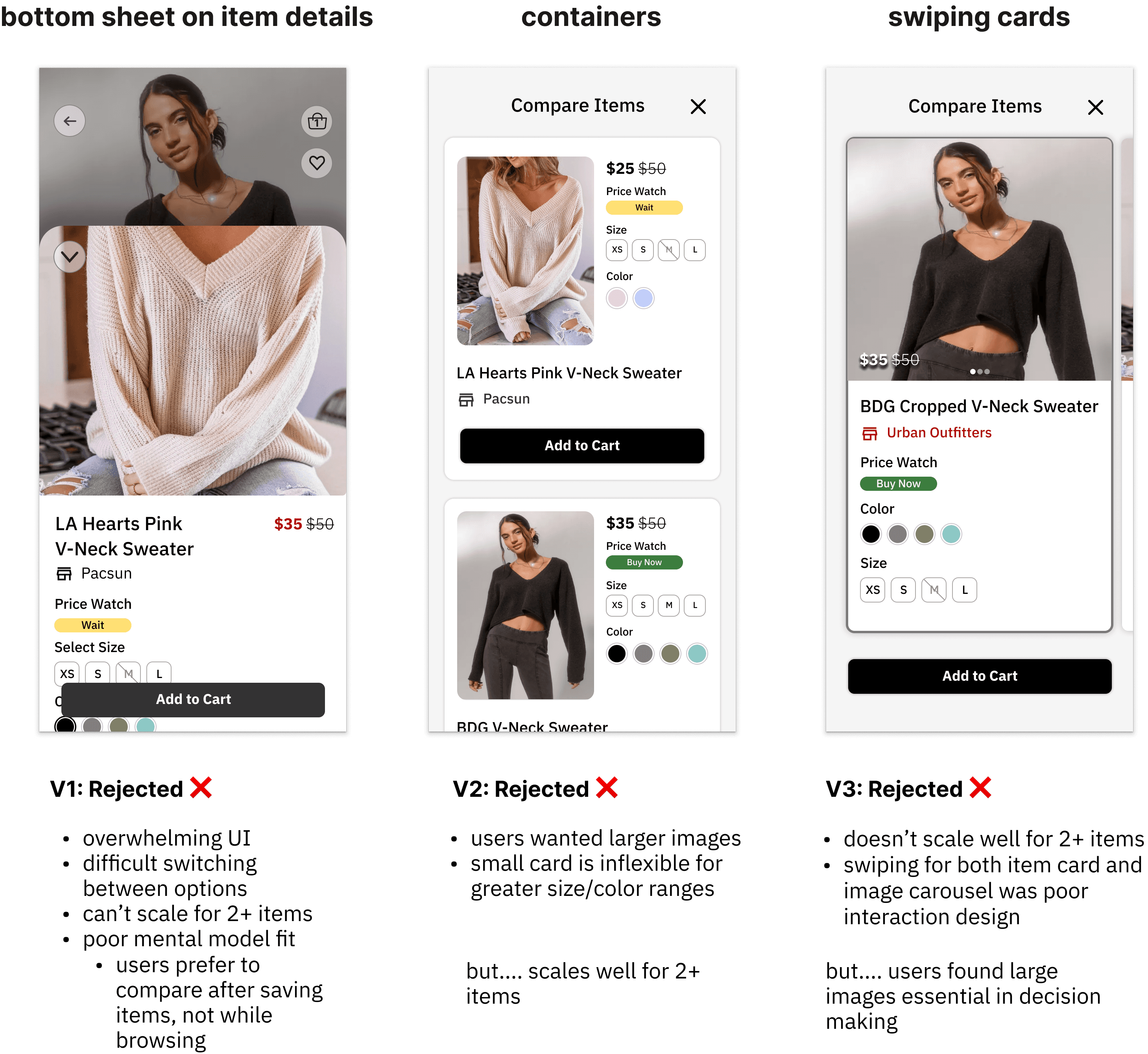
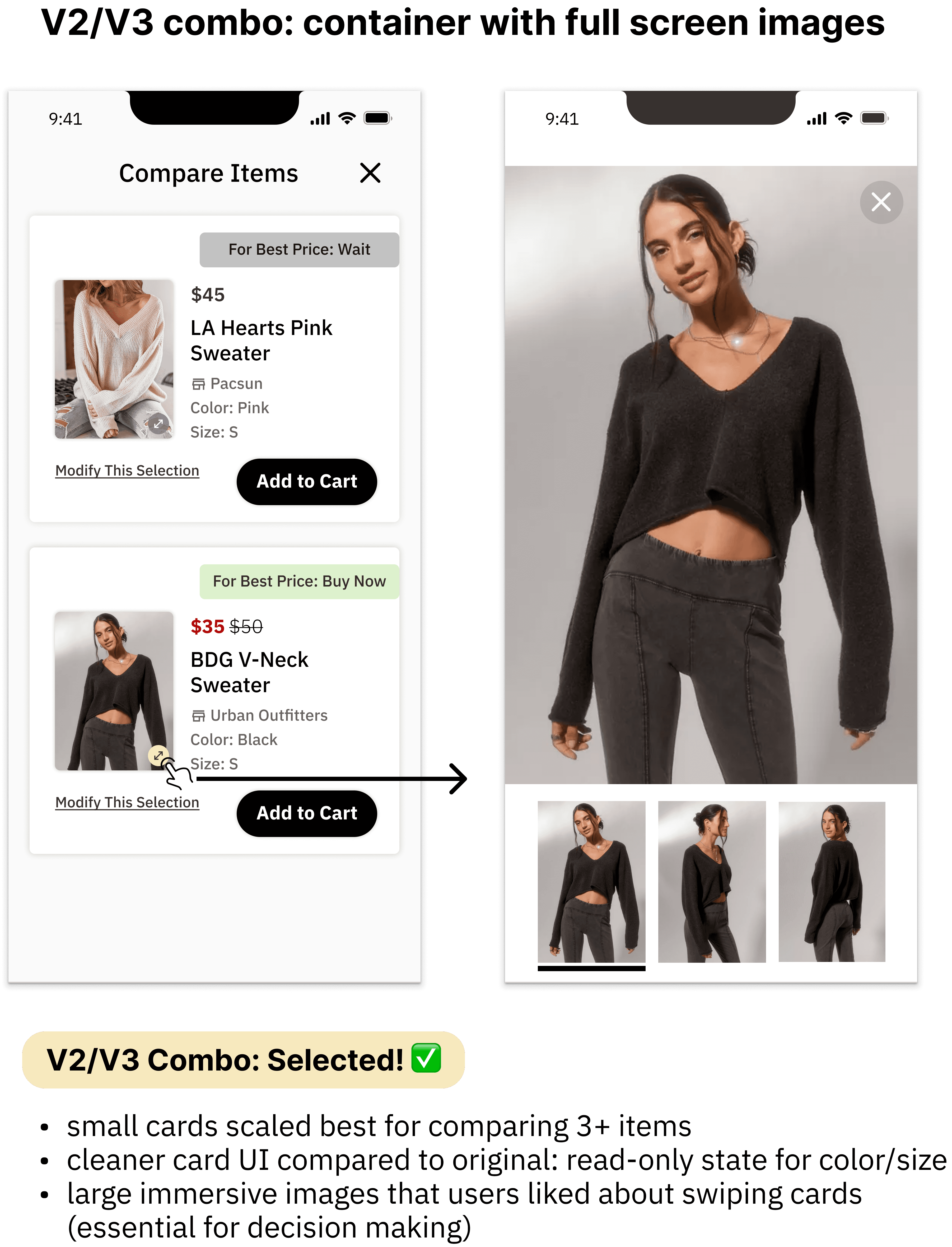
There were major issues with all of my designs, so I ended up combining the aspects users liked about the containers and swiping cards design to create the final feature.
Final Designs
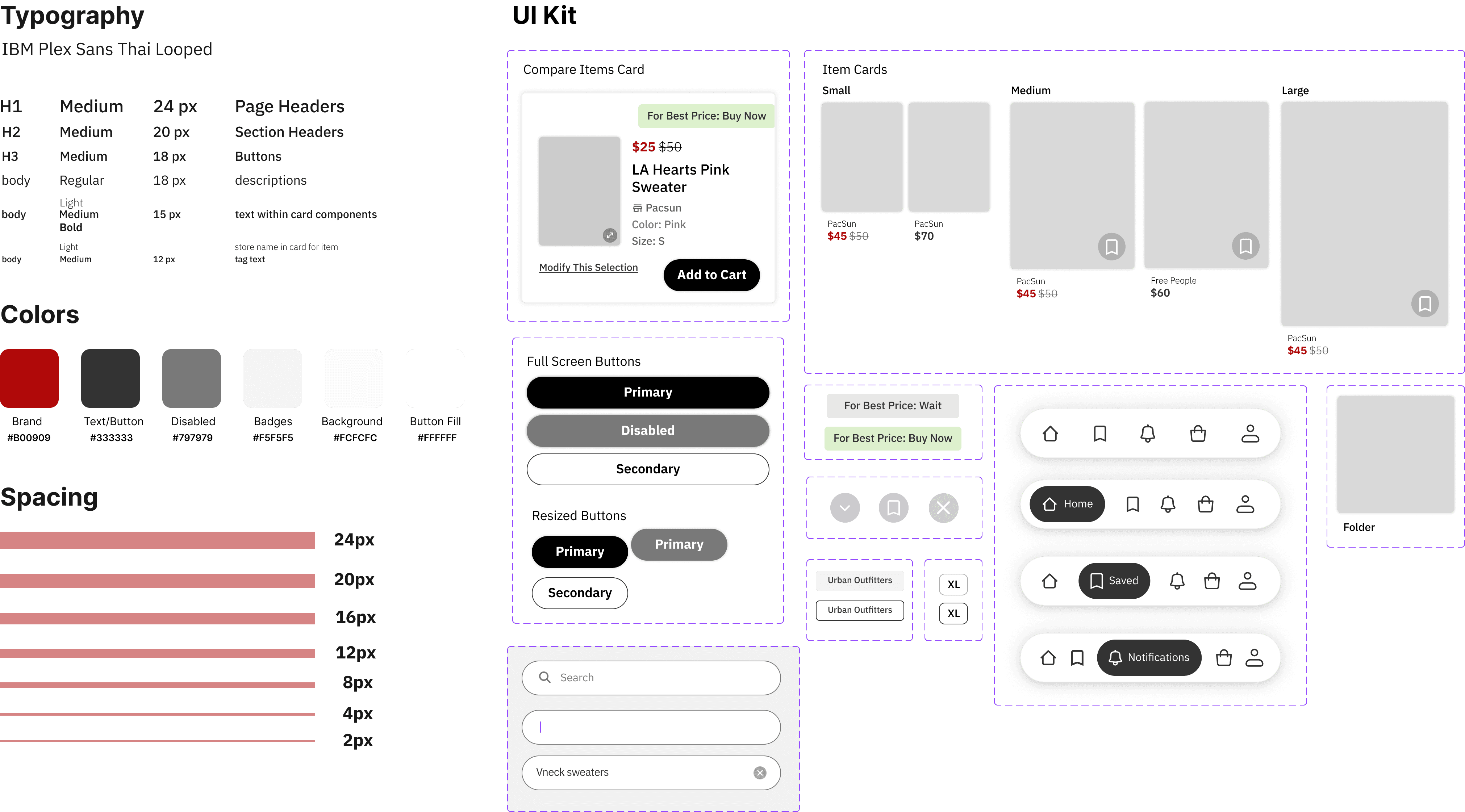
Creating a Design System
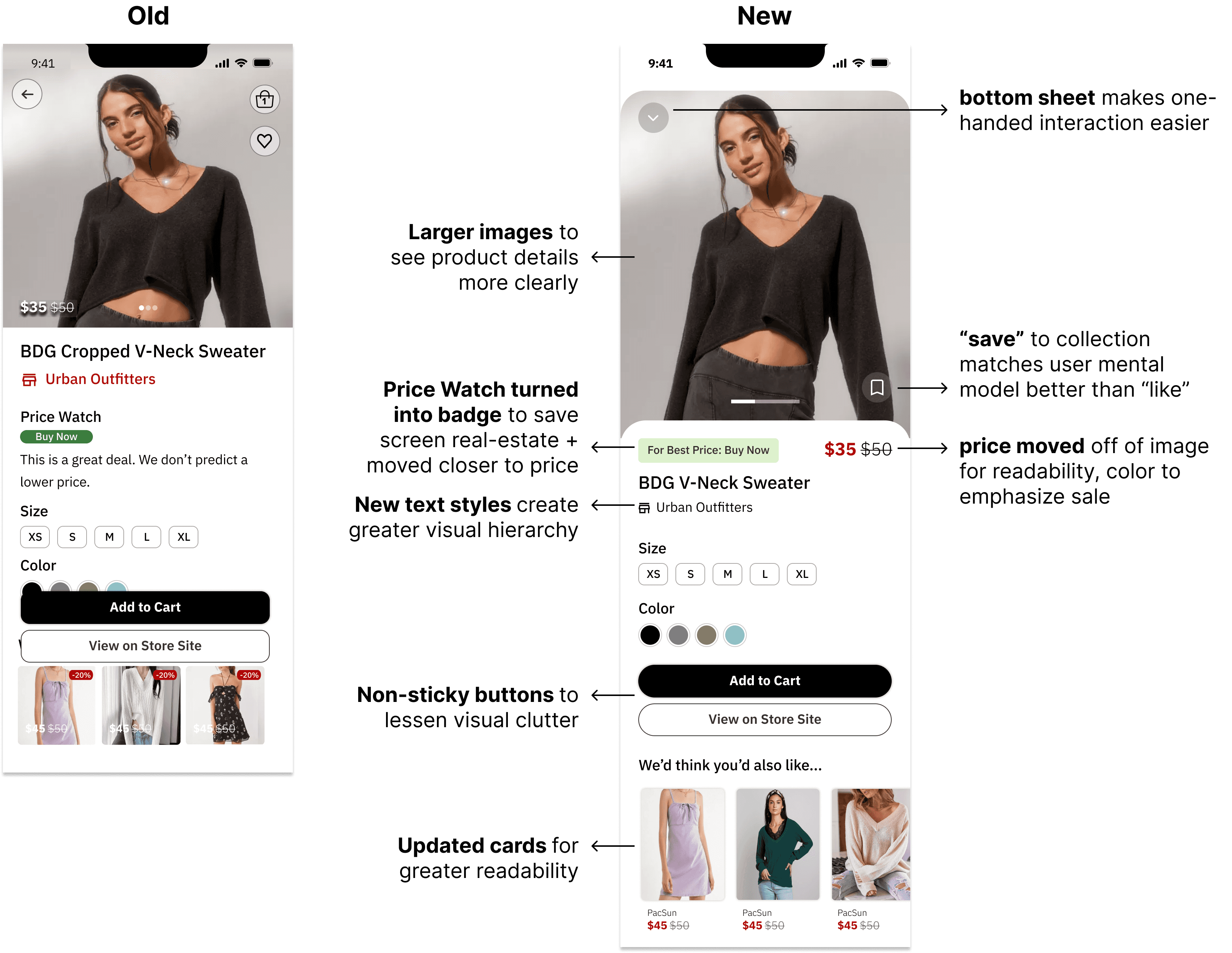
When I revisited this project a year later, my other goal was to polish the UI to have greater consistency and look more modern. So, I created a design system.
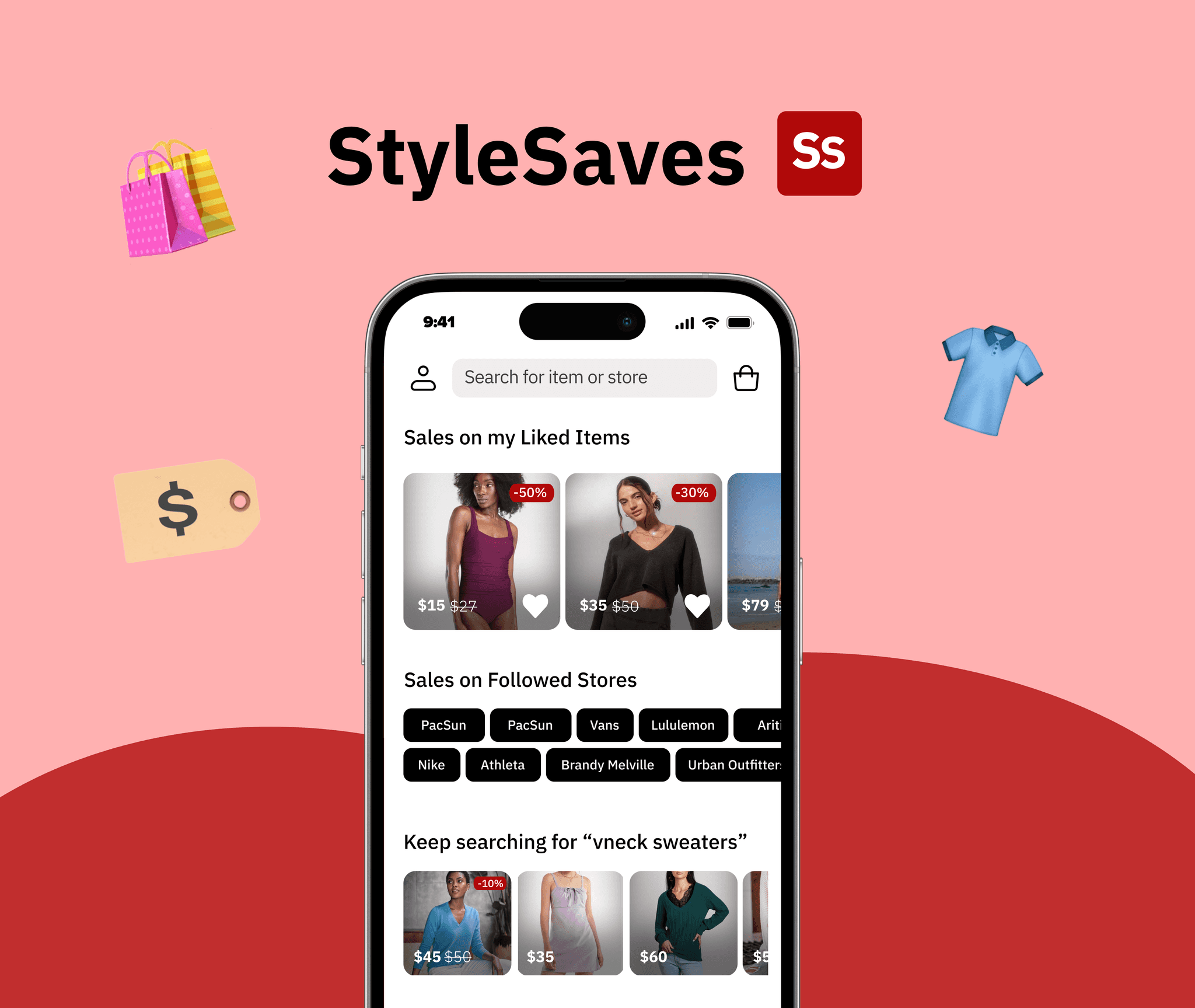
the final product: Key features
Easily Discover Relevant Options
HMW simplify item discovery across brands without overwhelming users?
follow brands and save items to inform app on style preferences
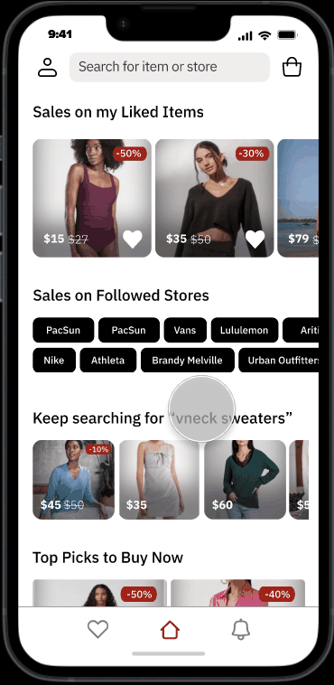
personalized home page recommendations from browsing history, saved items, and followed brands
search for items across brands in one place
see only relevant options with extensive filter/sort
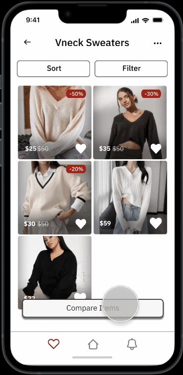
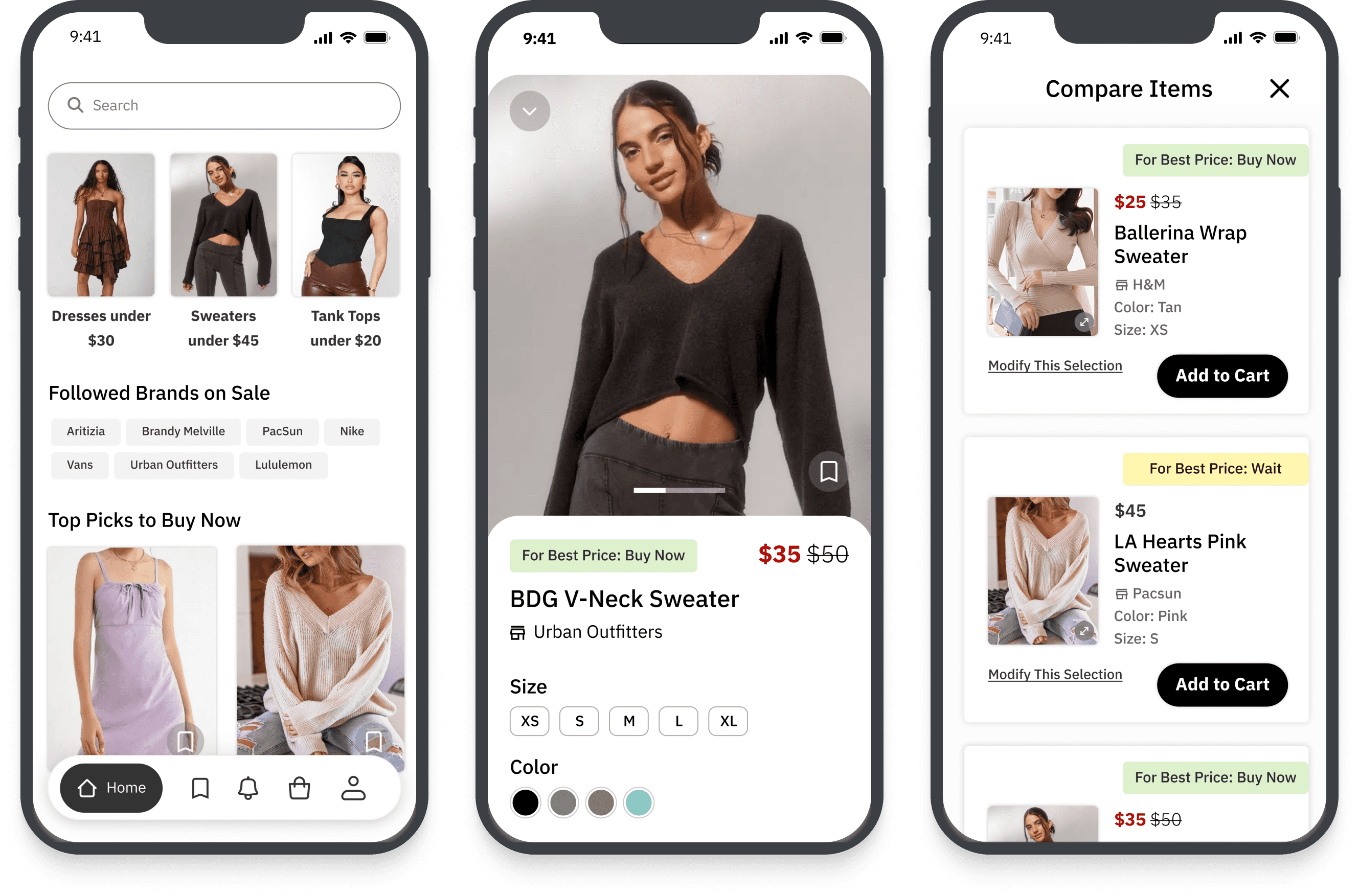
Compare Multiple Items on One Page
HMW make item comparisons, especially across brands, easier?
eliminate back and forth tab switching and streamline decision making
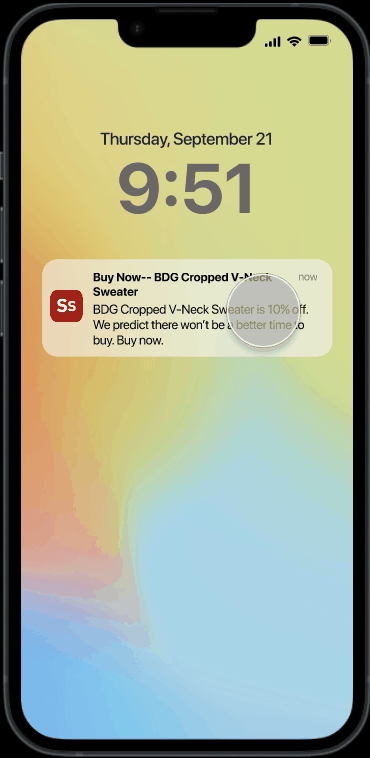
Smart Purchase Insights
HMW provide the price information needed to incentivize making a purchase decision?
Brand data used to predict cheapest time to purchase item
view brand sales and shipping policy to factor all costs of a potential purchase
Extra: Considering Business Needs
Creating a Business Model
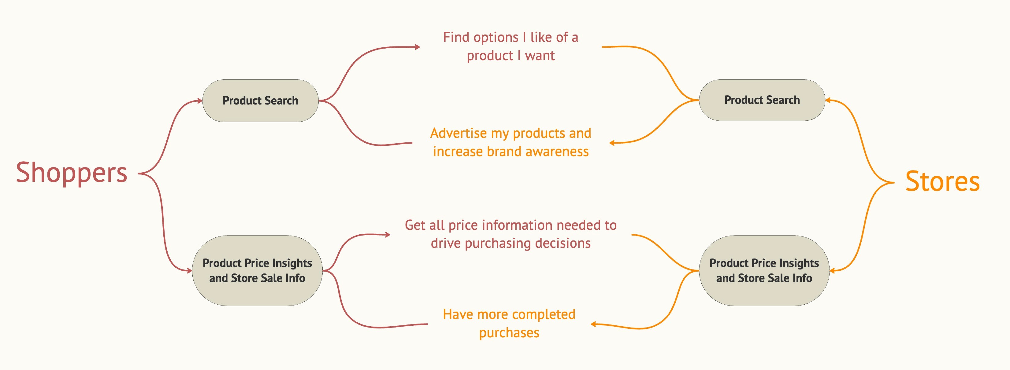
This product isn't real, but I wanted to design as if it was. How would the product generate revenue, and how could business needs affect my prioritization for designing?
I created an affiliate program business model: brands join Stylesaves to reach new shoppers and receive more orders, and Stylesaves generates commission whenever users use the app to complete a purchase.
Making this model drove decisions like moving the cart to the navigation bar during my site map revisit because it was so crucial to the business the checkout experience needed as little friction as possible.
Measuring Impact
I also wanted to think about how I could measure the impact of my designs if StyleSaves were to launch. To test how well my designs addressed the biggest user pain points of 1) effortful discovery and comparison of items across brands and 2) getting price insights to help make a purchasing decision, I’d track metrics directly addressing these pain points.
usage rate of direct comparison
conversion rates from each feature
Reflections & Takeaways
challenging instinctive design decisions
Designing from scratch without constraints like a design system or existing information hierarchy, challenged me to constantly question and justify every design decision, enhancing my critical thinking skills.